#Digital Art Tutorial
Explore tagged Tumblr posts
Visit Tumblr Blog
Explore Tumblr blogs with no restrictions, modern design and the best experience.
Last Seen Tumblr Blogs


Fun Fact
Tumblr is available in 18 languages.
Text

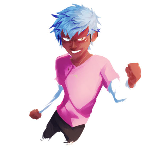
Dragon beetle! its a mix between my faves : dragonfly and hercules beetle if you want to support me on bsky!
#artists on tumblr#digital art#fantasy#dragon#creature design#insects#beetle#dragonfly#brartist#illustration#digital illustration#lilsiriusart#digital art tutorial#drawing
41 notes
·
View notes
Photo


Hey, friends! Meg here for TUTOR TUESDAY! This is a bit of a long one, but I’ve gotten a lot of requests for tips on transitioning from traditional to digital work! I tried to cover all the bare basics, but its up to you guys to explore! Here’s a more in-depth tutorial on how to create your own brushes, and heres one on the steps I use when drawing digitally. If you have any tutorial recs send ‘em in here or my personal! Now go forth and I’ll see you next week! (Source: 1)
#tutorial#photoshop tutorial#digital art tutorial#art tutorial#drawing tutorial#photoshop#psd#basics#art#ref#reference#art reference#tutor tuesday#thundercluck chicken of thor
16K notes
·
View notes
Note
Hii! I love your art so much! I have a question if you do not mind; how do you shade? Or well, it kinda looks like you added a "noise effect" layer over it but then again it also doesn't look like that. I just want to know how you make your art look so,,- texture-y??? I hope you understand what I mean ^-^" have a nice day! (And keep up the nice artwork 🫶🏻)
Thank you so much, I'm really glad you like my texture sm!! It's one of my favorite features for sure so I hope that helps <333
I know this isn't exactly tumblr's thing but I figured it'd be easier for me to show you how I do it rather than tell!!
I basically use this method on the video to add the realistic texture on top of the finished art, and in general I use a LOT of textured brushes!! For lineart, for base colors, textured brushes are your best friends! My favorites are chalk brushes and pencil brushes but there're tons of other types of textures you can try, like gouache, watercolor, oil painting, and all of them look wonderful with the paper texture above!!
As for the brush I used in the video for the light texture layer, it's this type of brush:
You'll find the link in my "brushes" highlight on instagram!
If you don't use procreate, just look for similar brushes and I'm sure you'll be able to achieve the same effect!!
#mew responds#apologies for the wait !! i was pretty busy until recently but I've finally been able to put this together for you <33#i had the recording for a while now but was only able to edit it these days geez#art tutorials#art tutorial#art resources#digital art#paper texture#digital art tutorial#artist on tumblr#digital artist#procreate#digital drawing
43 notes
·
View notes
Photo


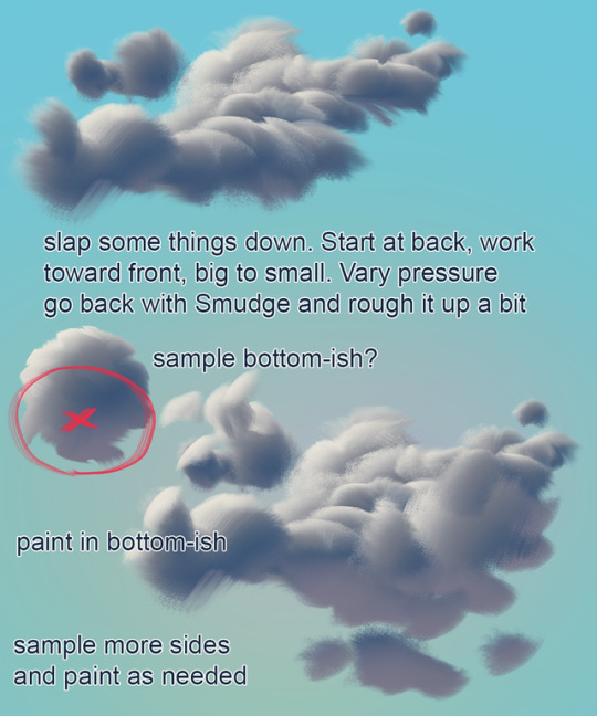
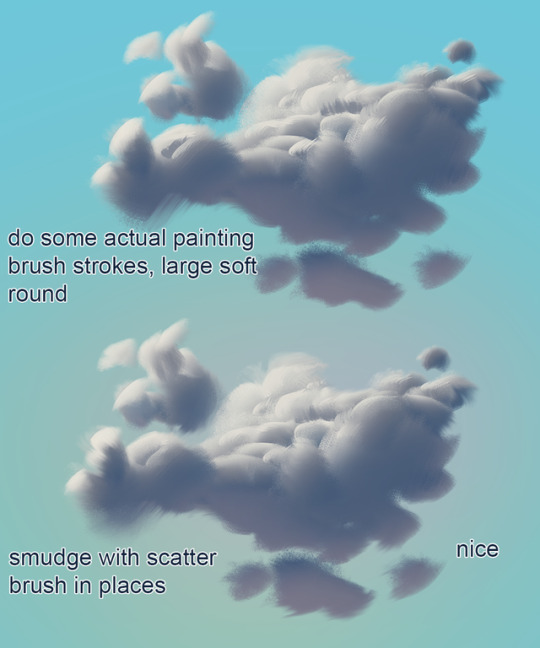

mixer brush cloud painting mini tutorial
not a replacement for actual painting!!!
Brush: https://drive.google.com/open?id=1iNOQmtBqiU1K3MnnUH4fmciUYGjv6Hcm
13K notes
·
View notes
Text
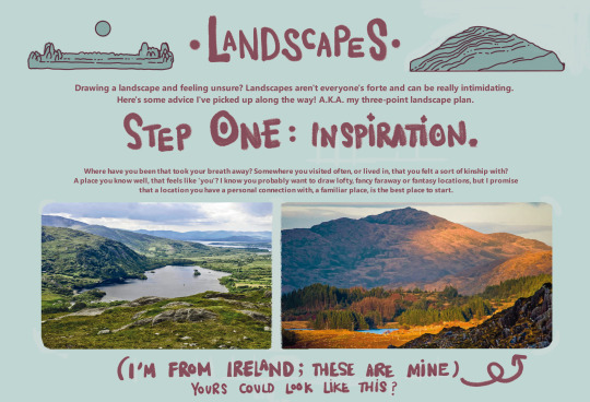
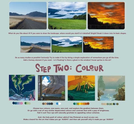

here's a landscape tutorial!
i focused on natural environments for this one, if you find it helpful I'll be back with how I learned to draw buildings.
let me know if it helps! and have fun drawing ✨
#this was really fun to put together actually hehe#tutorial#art#illustration#digital painting#digital art#artists on tumblr#digital artist#digital illustration#radarplz#sketch#my art#bethfuller
19K notes
·
View notes
Photo

Da, da, da, daaaaaaaa...... that’s a little more dramatic than I had intended. I love all these wonderful Sai tutorials that get posted on here but I haven’t seen much attention payed to Sai’s Lineart tool which I can’t get enough of. I’m sure there probably are Lineart Layer tutorials out there - I just haven’t come across one so I’m just adding to the pile. The Lineart tool is so awesome it deserves any number of tutorials anyway. It’s so easy to use, it saves me so much time, and it offers so much control which I really love. Honestly, the tool is so easy to use that this is less of a tutorial and more of just a general encouragement to just whip it out and start playing with it. Yeah. So say we start with a simple line like this swirly-wirly thingy that I drew with the marker tool. Well, the first step would be to create a linework layer by clicking the linework layer button.

There we go. Now, a lineart layer in Sai is different from any other regular layer in Sai and it will bring up a completely new range of tools. I’m gonna briefly go through them but the best way to understand exactly what each does is to just try them out for yourself. There’s no substitute for experience or however the saying goes.
Pen - This is your freehand lineart tool and to best honest I don’t really use it that often. That’s just me personally. I have an expensive gaming rig that has all sorts of magic running under the hood but we all know that Sai’s memory management is pretty crappy and I don’t need the lag or crashes that come with this tool when working at a high DPI. You may have a different, entirely pleasant experience with this particular tool but for me, if I’m doing freehand inking, I’d much rather just use the regular Pencil tool.
Eraser - Kinda speaks for itself.
Weight - This one I do love. Say you’ve drawn a line - or a path as Sai calls it. With this tool you can adjust the thickness of the particular line by simply selecting the brush size and then clicking on the line.
Color - Same as Weight. Simply select your desired colour and then select the desired line you’d like to change. Very useful. For the aesthetic.
Edit - This one comes with its own subset of mini-tools that I’ll get into in a moment. But this is definitely a useful tool - for me it’s probably the most useful.
Pressure - This is the one that adds the character to your linework. I’ll explain further below.
SelPen - A selection tool. Pretty standard. Since the Lineart layer works in ‘Anchor’ points (which again, I’ll get in to further down below) I don’t really use this one.
SelErs - Selection Erase. Goes hand in hand with the SelPen. I can’t say that I personally use this one much.
Curve & Line - The Curve and the Line tools are the cornerstones of the Linework layer. I’m explain both further down.
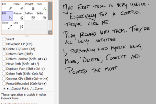
The Edit tool, as I mentioned, brings up its own list of sub-tools. And they definitely have their uses. Again, it’s best to play around with them to truly get a grasp of what they do but I’ll just run through them quickly before I get on with the main tutorial.
Select - For selecting anchor points of paths. Honestly, I don’t really use this one too much simply because hovering over a point or path and clicking will select it.
Move/Add - Now this one I use a lot. Moving an anchor will affect the curvature of your line if you’ve used the ‘Curve’ tool, or you can add curves to a straight line by clicking and dragging in between anchor points.
Delete CP/Curve - Kinda speaks for itself. It will delete an achor point in your line. Sometimes this can be useful for making your curves rounder if you’ve added too many points to it.
Deform Path - Again, kinda self explanatory. It will warp your line. I don’t really use this one myself but that’s not to say that it couldn’t have its uses.
Deform Anchor - See above.
Move Path - Instead of moving just an anchor or adjusting the curvature of your line you can move the entire line at once. Can be useful.
Duplicate Path - Does exactly what it says - creates a copy of your line. Haven’t found much use for this simply because I don’t particularly like copy/paste stuff in linework. Faults or differences add character.
Delete Path - deletes a line you’ve drawn independently of other lines on your linework layer. Can be useful as well.
Connect CPs - This is difficult to explain the benefits of. It’s one that should be experimented with. It basically joins lines together. I use it quite often. Just pick this option and drag from one anchor point to another to join them.
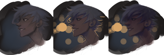
Pointed/Rounded - See the diagram below for this one. I find it very useful.
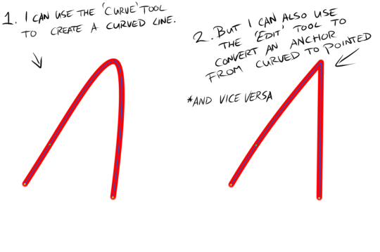
As you can see I used the Curve tool to draw a simple curve (left) and then I used the Pointed/Rounded tool to convert the curve into a point (right) by selecting the tool and then clicking on the anchor point at the height of the curve. I find it very useful. Anyway, back to our swirly-wirly thingy.

Because our swirly-wirly thingy is basically one long curve, I simply select the curve tool and start clicking. Starting at the centre point on one end, I click to add anchor points as I trace the shape of the object. Each point adjusts the curvature from the last point. It’s kinda hard to explain verbally or even visually but try it out and you’ll quickly see how it works.
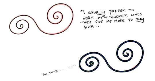
Once I have a line over whatever I’m inking done I like to adjust the weight to suit my preferences. I like to work with thicker lines because they give more room to play around with weight. So to adjust the weight you click on the Weight tool, select a brush size and then click on your line. If only it were that simple in life.
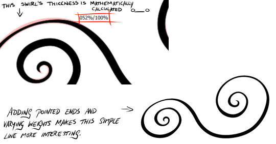
Once I have a good weight selected I move on to the Pressure tool. The pressure tool gives you two options. Pressure for width and pressure for density. Width is like controlling the weight of the line at individual points and density controls the transparency. I don’t usually use the density option. As with traditional inking I prefer to denote depth, shadow, etc. with weight as you can see in the image above. To adjust the pressure, simply select the pressure tool and then select an anchor point. Click, hold and drag to the left to make the line thinner of more transparent and to the right to make the line thicker and more dense. As you drag, a percentage will appear over the anchor point you’ve selected. This can be useful for keeping things consistent.
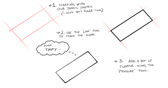
That’s all well and good for curved lines but what about straight lines? That’s where the line tool comes in. It works exactly the same way except it won’t add a curvature to your anchor pints. Still very useful though. Especially when combined with the Weight and Pressure tools.
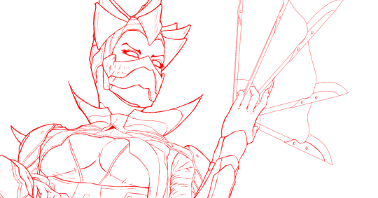

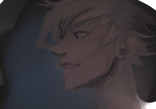
Here’s an example of one my drawings. It’s Dark Empress Kitana from Mortal Kombat. The one in red is the pencils which if converted to black would probably make a pretty good linework layer. I’m a firm believer in taking the time to clean up your sketch/pencils layer because it will dictate your entire drawing. The one below in black was done using Sai’s linework layer feature. Although not entirely. As much as I love Sai’s linework layer, it can look a little too clean which is not great when you're drawing people. Although, it's all art so it's all up to personal preferences and personal style. There's no wrong way to do it. For me though, I prefer to do skin, facial features, hair, etc. by hand using Sai's Pencil tool on a normal layer and reserve the Linework Layer for architecture, clothing or any non-organic substances. I inked Kitana's eyes and eyebrows freehand ( or as freehand as you can be with Sai's amazing stabilisers) but everything else such as her armour or her fan weapon thingy was done using the Curve and Line tools on the Linework Layer. I hope this tutorial has been useful. Or if not useful - then at least encouring to try out Sai's linework layer. It's such a robust feature that I don't see get much attention and I can't even begin to describe how much time it saves me or how much I adore it. If you have any questions (because I'm well aware how unsuited I am to writing tutorials - this is so damn rambly - sorry!) then feel free to drop me an ask here at keithbyrneart. P.S, sorry about my handwriting in the stills. It's gotten a lot messier these days.
#tutorial#art tutorial#digital art tutorial#paint tool sai tutorial#art tips#sai tutorial#digital art#fan art#art#inking#line work#lineart#ink#art reference#paint tool sai#sai#art help#art ref#ref#drawing#artists on tumblr
12K notes
·
View notes
Text
Here, take my industry secrets.
I don't want people to spend their money on art school when I can make resources for free for them.
Hey here's a step-by-step guide to making concept art pieces using the industry "Collage > Painting" pipeline. It's how artists pump out a shit ton of concept work for their bosses at record speeds. Intended for newer artists!

For more stuff join my discord! I'm a transfem streamer who makes art stuff!
#art#artist#digital art#illustration#digital painting#digital artist#tutorial#art tutorial#digital art tutorial#digital painting tutorial#painting tutorial#concept art#concept artist#concept art tutorial#transfem#transfem artist#trans artist#transgender artist#transgender
192 notes
·
View notes
Text
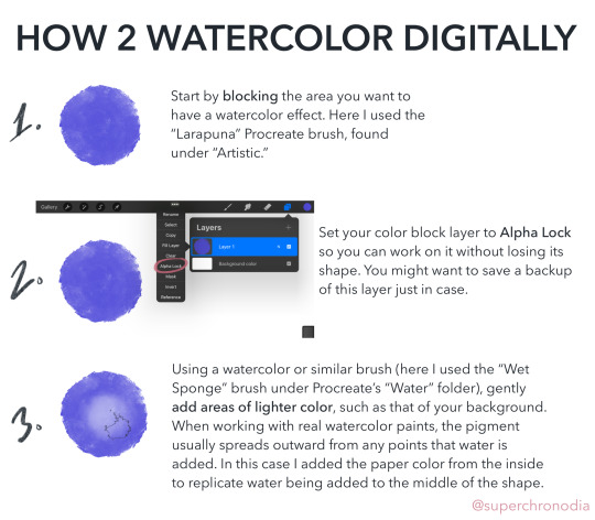
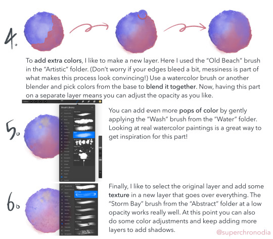
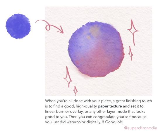
super epic watercolor tutorial
#casey art#art tutorial#digital art tutorial#digital watercolor#procreate tutorial#wahoo I’ve never done anything like this b4#if you use this lmk! or tag me or whatever#there’s a version with alt text on my twitter as well#update 3/12 DON’T copy my tags
10K notes
·
View notes
Text
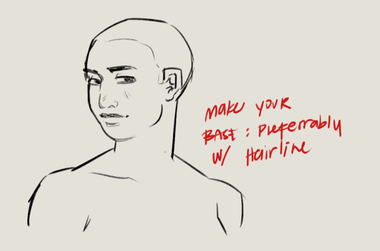
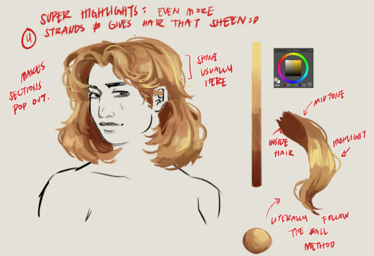
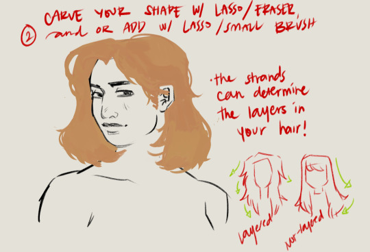

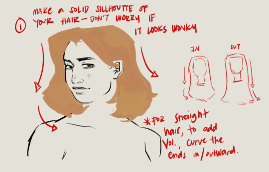
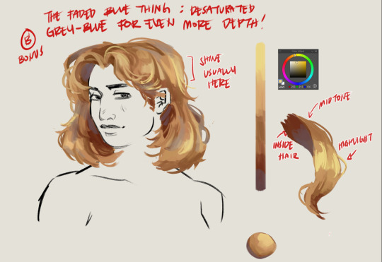
Hairt art step by step
#artists on tumblr#baliwart#art tutorial#hair art#hair art tutorial#digital art tutorial#digital art tips
774 notes
·
View notes
Photo
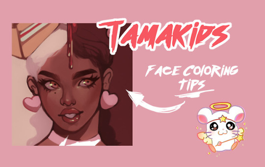

couldn't make a full tutorial but here are some tips on coloring faces, just some tips I use personally to help me paint
9K notes
·
View notes
Text
Digital Painting: tips for beginners
Heyo! I got asked if I could make a tutorial on digital painting so I’m gonna throw together some advice meant for people who are starting out and want to figure out exactly how this stuff all works. Because it’s hard! What I hope to accomplish here is to make painting more approachable for you.
Firstly, I have put together something like this before, so for archival purposes here it is: http://holy-quinity.tumblr.com/post/89594801811/i-dont-know-how-much-of-this-kind-of-thing-you
For those of you who don’t wanna bother reading that, here are the main points:
1. Learn your program and its tools, from brush properties to layer styles. And I mean learn them. Make a cheatsheet that shows you exactly what each button and scale does, both in isolation and in conjunction with other buttons and scales. Refer to this as much as possible until it is intuitive. The end goal is to know exactly what to do to your brush’s settings to achieve a given effect.
2. It’s perfectly okay to use your sketches, linearts, and other forms of line in your paintings. They can help guide the form and there’s no need to make something fully “lineless”! I never make things “lineless.”
3. Study other people’s art and try to think how they could have possibly achieved the effects they did. You can learn a lot just by observing and mentally recreating the process stroke by stroke---muscle memory is a powerful tool at your disposal. This becomes easier to do once you’ve started doing item 1 above.
OKAY!
So where the heck do you even begin?
What I’m gonna do is try to make digital painting as approachable as possible for someone who’s never really done it. The main idea here is that digital painting is just like real painting. So if you’ve ever done real painting, you already kinda know what’s coming.
I’m gonna assume you know the basics of digital art: you can sketch, line those sketches using layers and opacity changes, and fill the lines with color, maybe even opting to add some shading...and you’ll get something like this:

You know, cell-shaded, or maybe the shading’s blended, but you’ve still obviously a line drawing with color put down on layers beneath the lines.
The next intuitive step is to try going “lineless”...but when you remove the lines you get this:
idk about you but I’m laughing at how stupid this looks
When I was first teaching myself to paint digitally, I didn’t really know how to deal with this. Without lines, the form of the subject vanished or became a mess like the above. Even if I was meticulous and careful about placing down the color such that without the lines layer turned on, the shapes fit together, it didn’t look quite right. There’d be gaps, I wouldn’t know how to incorporate the subject into a background, the contrast wouldn’t be high enough, or it’d just in general look too much like a screenshot from Super Mario 64.
Painting requires a different process than the above. You’ll have to let go of some of your habits and conventions. Such as staying in the lines. Such as fully relying on the lines. Like, I love my lines, I love my sketches---but in painting, they are guides for form, and are not the form itself. So let me go through how I approach a given painting:

My painting process starts with a sketch (here a boring portrait for demonstrative purposes). I make the opacity of the sketch layer something like 30%, and then throw down my base colors on a new layer underneath. I’m not being meticulous about the sketch itself, because again it’s just meant to guide my placement of color. I’m also not meticulous about my placement of the color.
We’re essentially sketching with color. Because ultimately what we want is for the color to take on the form and shapes conveyed by the sketch.
There’s a lot going into this about how to use value, how to shade, how to use color, etc. that I’m kinda skipping over because it takes a lot of time to explain...but there are hundreds of tutorials out there on those topics so please, google around! I found some helpful tuts that way when I was starting out.
Something I find v useful is to keep selecting colors that already exist in your image for shading and hue adjustment. This is why I start with really blendy, low-opacity brushes when throwing down color on top of the background. I can then select colors within there that are a mix of the two.
For instance, I’ll select the color of the lines here:

...and use that to shade:

And maybe I’ll select one of the darker shades around his eye, but not the darkest, to make the shading a smoother gradient...and so on.
What I do in general at this point is go over the shapes and lines of the sketch. Such that I can turn off the sketch layer and see this:
I’m replacing the lines with shading and value. I’ll continue to do this as I keep adding color.
This is all super loose. I am not dedicated to any particular stroke. I just want the colors and shading and light source to be right. I’ll use overlay layers to boost contrast or add a hue.
Here are other examples where I used this process:

I am constantly changing brushes and brush settings as I paint. It really depends on what effect I want where. I am also constantly selecting new colors and applying or blending those in. I don’t believe in having some uniformly applied base color and then shading with only one or two...that’s what I’d do if I was cell-shading like the first drawing I showed you here, but painting should be about messing with color and opacity and blending to make millions of hues!
Good rule of thumb: Hard, opaque brushes for applying color. Soft, dilute brushes for blending colors. Sometimes hard, dilute brushes can make some cool blending effects! I personally prefer harder edges on my shading so that’s a brush I use often.
This is getting a bit long so I’m gonna split it up into multiple parts, but really what I want you to get from this is:
1. learn the tools at your disposal until they are intuitive
2. sketch and line are guides for form, not the form itself
3. rather, hue and value will produce the form
And of course, practice makes perfect!!! Every drawing you make, every painting you make, will bring you one step closer to the artist you want to be, and thus every drawing and every painting, no matter what, is a success.
9K notes
·
View notes
Note
hi!!! I have literally no idea if you do tutorials or advice, but I was wondering what your process for rendering skin is?? you have such a lovely and realistic (but unique) way of coloring skin :)
I’m not very good at explaining my process so I hope this makes sense :)
For skin I start by picking a base colour (a mid-tone) then I can add darker and lighter shading depending on where my light source is.
I work in patches of colour (I hate blending haha) following the shape of the face/body part. I picture each part like a 3d object.

I adjust brightness and saturation as I go and add complimentary colours where I think the skins undertones would be (this part is just trial and error there’s no real skill to it it’s purely what I think looks nice)
This is just how I do it and I’m sure there’s artists who can explain colour theory and lighting for skin a lot better :) but I hope this helps! <3
#ask response#art tutorial#tutorial#my art#answered asks#ask box#artists on tumblr#art#digital art#artwork#draw#drawing#ask#asks open#artist#surrealist art#animal art#procreate#illustration#digital painting#rendering
173 notes
·
View notes
Photo

Layer Effects Tutorial by Robin
#art#layer techniques#digital art#digital art tutorial#layer effects#rockinrobin#blending layers#layer effect tutorial#digital art techniques
6K notes
·
View notes
Text
Here's some notes on some of the upper body muscles so you, artist, don't need to look them up

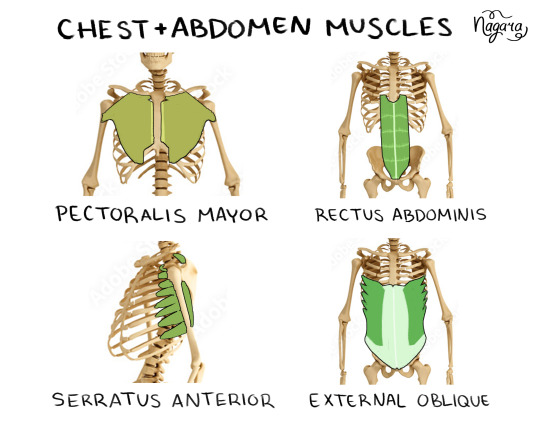
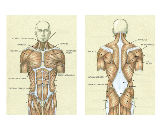


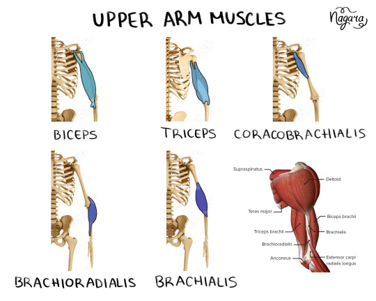
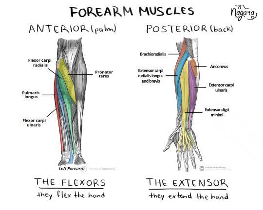

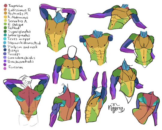
They are not medically accurate, just enough for artists to know the necessary muscles and how they work together
I 100% recommend doing the last exercise I did to be able to actually place the muscles
Here are my notes on the lower body muscles
#lower body muscles notes coming in a month#don't even ask about the forearm there's just too many muscles there#art study#muscles study#upper body muscles#art tutorial#anatomy notes#artists help#nagarart#drawing#digital art#my art#art
47K notes
·
View notes
Photo


I love coloring the lines of my lineart directly, and having it separate from the background is super-useful. Here’s a quick trick I learned for doing just that.
Want more tutorials? Please consider supporting my Patreon!
6K notes
·
View notes
Text


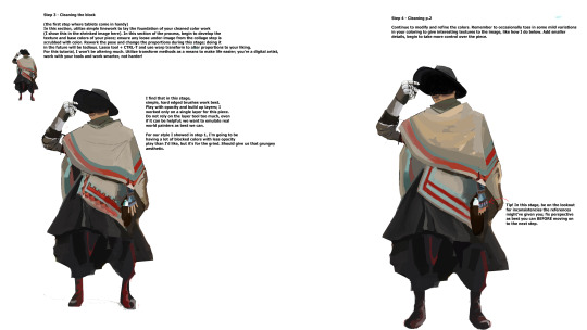
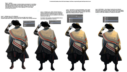
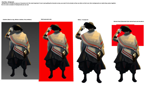
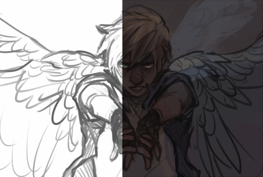
a short/mini digital painting tutorial by yours truly 🫡
a lot of people really like how i painted kaveh in that short hkvh comic so i thought i'd share a quick painting tutorial! I hope this can be helpful to yall ^_^
#also if you'd like a more in-depth understanding of light & shadow i highly suggest Angel Ganev on youtube#dude explains so well and i like how he respect people's art styles as he improves their art#art tutorial#drawing tutorial#digital painting tutorial#digital art tutorial#artists on tumblr#my art
552 notes
·
View notes